
General
19 Creative CTA Button Ideas to Boost Your Ecommerce Sales

Introduction
In the competitive landscape of eCommerce, the design and messaging of call-to-action (CTA) buttons are critical to driving sales. With the right approach, these crucial components can significantly enhance user engagement and drive conversions. This article delves into 19 innovative CTA button ideas that not only capture attention but also compel users to take action. However, businesses often struggle to differentiate their CTAs amidst overwhelming competition. By mastering the nuances of design, language, and placement, businesses can significantly improve their conversion rates.
Surge Affiliate Marketing: Expert Strategies for Effective CTAs
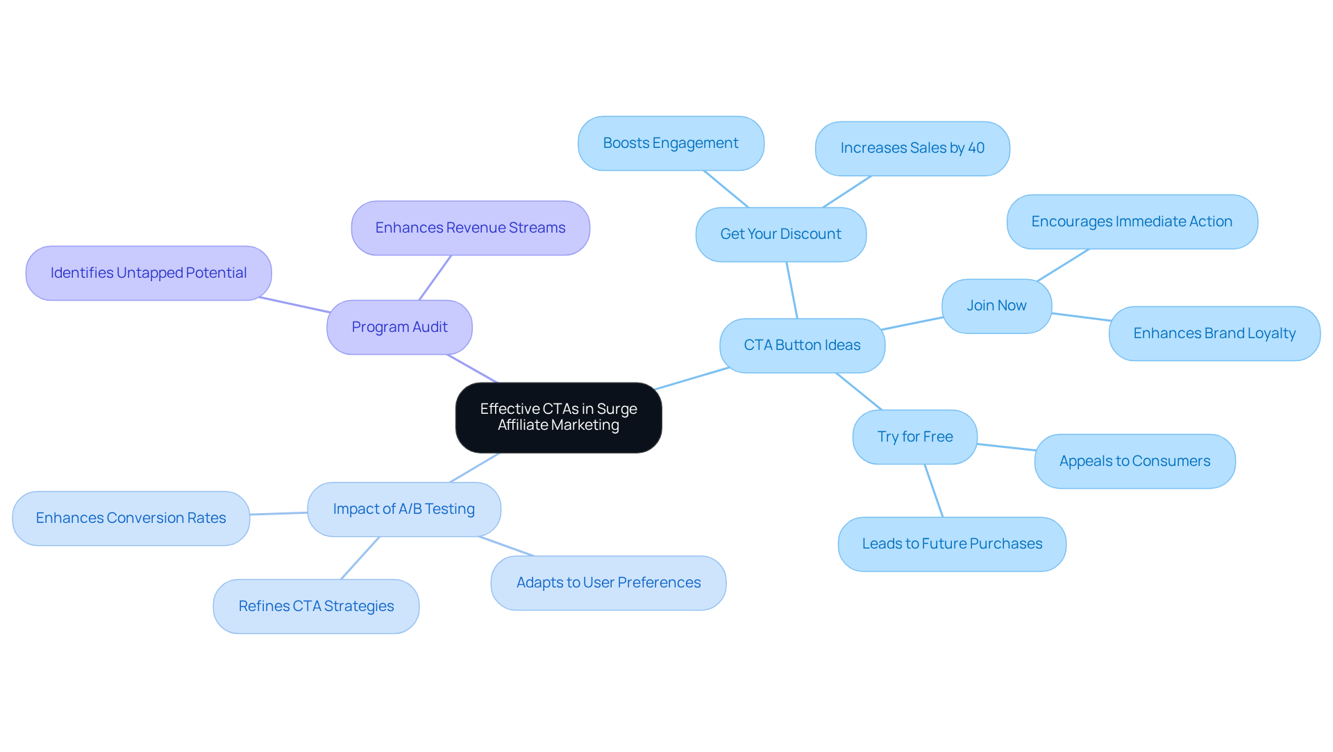
Aligning cta button ideas with brand messaging is essential for maximizing engagement and driving sales. Effective cta button ideas should be clear, concise, and designed to prompt immediate action from the audience. Phrases like ‘Get Your Discount’ or ‘Join Now’ have been shown to significantly boost engagement, resulting in a 40% rise in sales and a 46% reduction in costs according to case studies.
Regular A/B testing plays a vital role in refining cta button ideas, allowing businesses to adapt based on real user interactions and preferences. This strategic approach not only enhances conversion rates but also ensures that CTAs resonate with the target audience, ultimately driving sales and fostering brand loyalty.
Surge Affiliate Marketing also offers a complimentary program audit to help ecommerce store owners identify untapped potential in their affiliate programs, enhancing revenue streams.
KlientBoost: Innovative CTA Button Designs That Convert
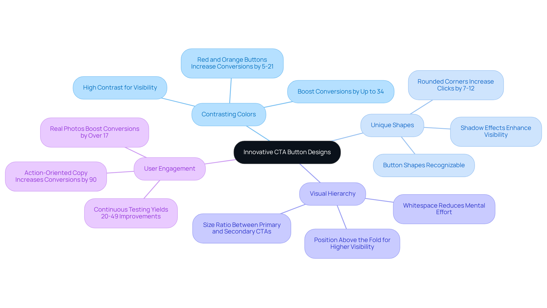
KlientBoost utilizes innovative cta button ideas that enhance user engagement and drive conversions. For instance, utilizing contrasting colors and unique shapes enhances visibility on a webpage. Their design philosophy underscores the importance of visual hierarchy, ensuring that cta button ideas are not only attention-grabbing but also intuitively positioned to guide individuals toward meaningful interactions with the brand.
Drip: Engaging CTA Buttons for Email Campaigns
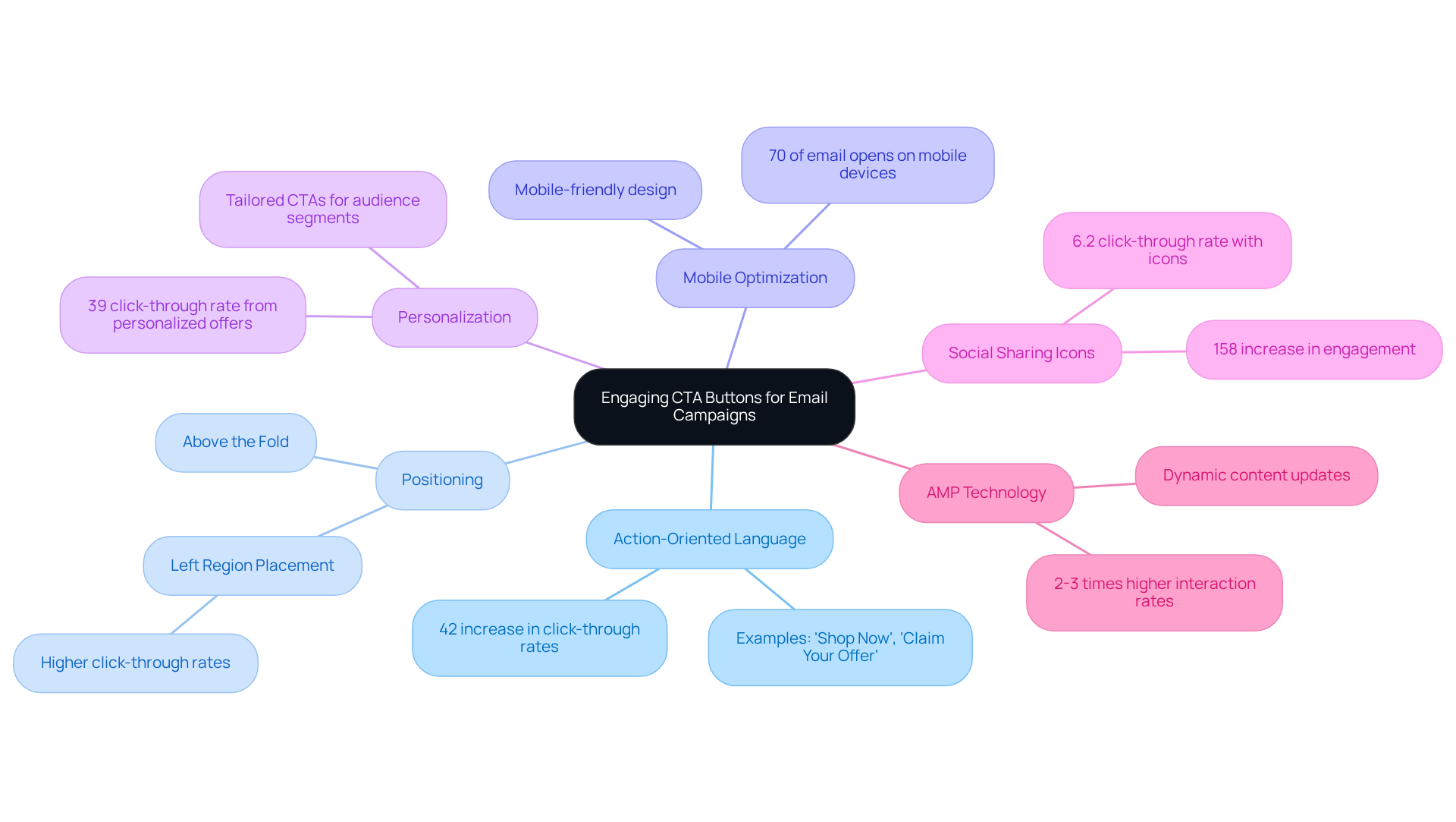
Effective email marketing hinges on the strategic use of engaging CTA button ideas. Employing action-oriented language, such as ‘Shop Now’ or ‘Claim Your Offer,’ can significantly encourage immediate engagement. Research shows that a single, clear CTA can increase click-through rates by as much as 42%, highlighting the effectiveness of straightforward design. Furthermore, positioning calls to action above the fold guarantees they are visible and accessible, maximizing user engagement opportunities.
In 2026, the emphasis on mobile optimization is paramount, as over 70% of email opens occur on mobile devices. Therefore, implementing effective CTA button ideas that are mobile-friendly and visually distinct is essential. A study found that calls to action positioned in the left region of an email yield higher click-through rates compared to those on the right, suggesting that strategic placement can enhance effectiveness.
Case studies reveal that brands utilizing personalized CTAs, tailored to specific audience segments, experience substantial increases in engagement. For instance, one campaign achieved a remarkable 39% click-through rate by aligning offers with the interests of its audience. This underscores how crucial it is to grasp customer preferences and behaviors in email campaign design.
Additionally, emails that include social sharing icons have a click-through rate of 6.2%, compared to 2.4% for those without, emphasizing the value of integrating these elements into email designs. As email marketing evolves, integrating AMP (Accelerated Mobile Pages) technology can further enhance interactivity, allowing for dynamic content updates within emails. Brands leveraging these innovations report 2-3 times higher click and interaction rates compared to traditional static designs. By implementing these strategies, brands can not only enhance engagement but also drive substantial revenue growth.
Figma: Designing User-Friendly CTA Buttons
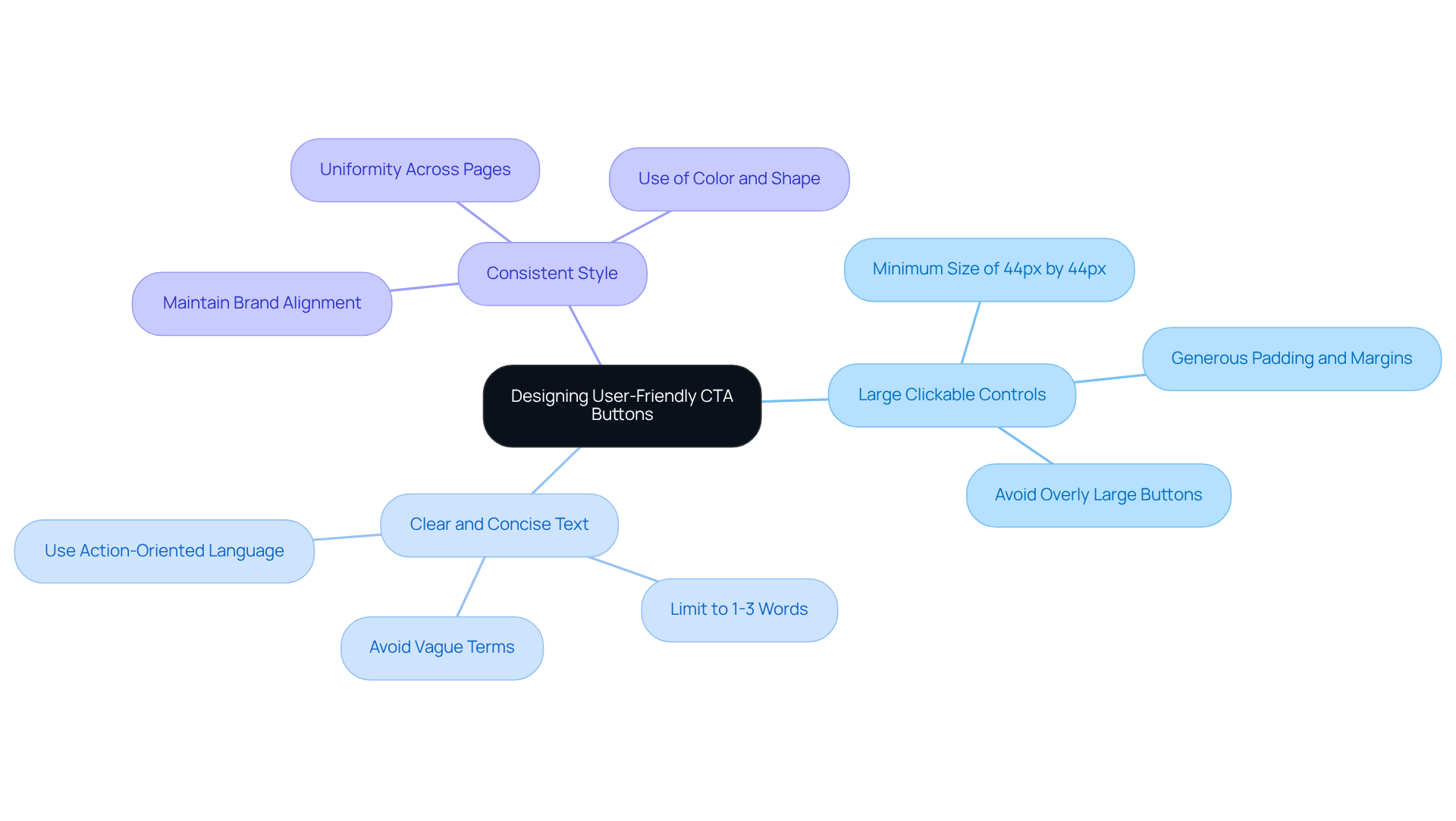
Designers often struggle to create effective cta button ideas that resonate with users, but Figma provides the necessary tools to tackle this challenge. Key design principles emphasize the importance of:
- Large, easily clickable controls
- Clear and concise text
- Maintaining a consistent style that aligns with the overall brand
These principles enhance user experience. Figma encourages designers to utilize prototyping features. This allows for the evaluation of design elements prior to implementation, ensuring they meet audience expectations.
ManyPixels: Crafting Visually Appealing CTA Buttons
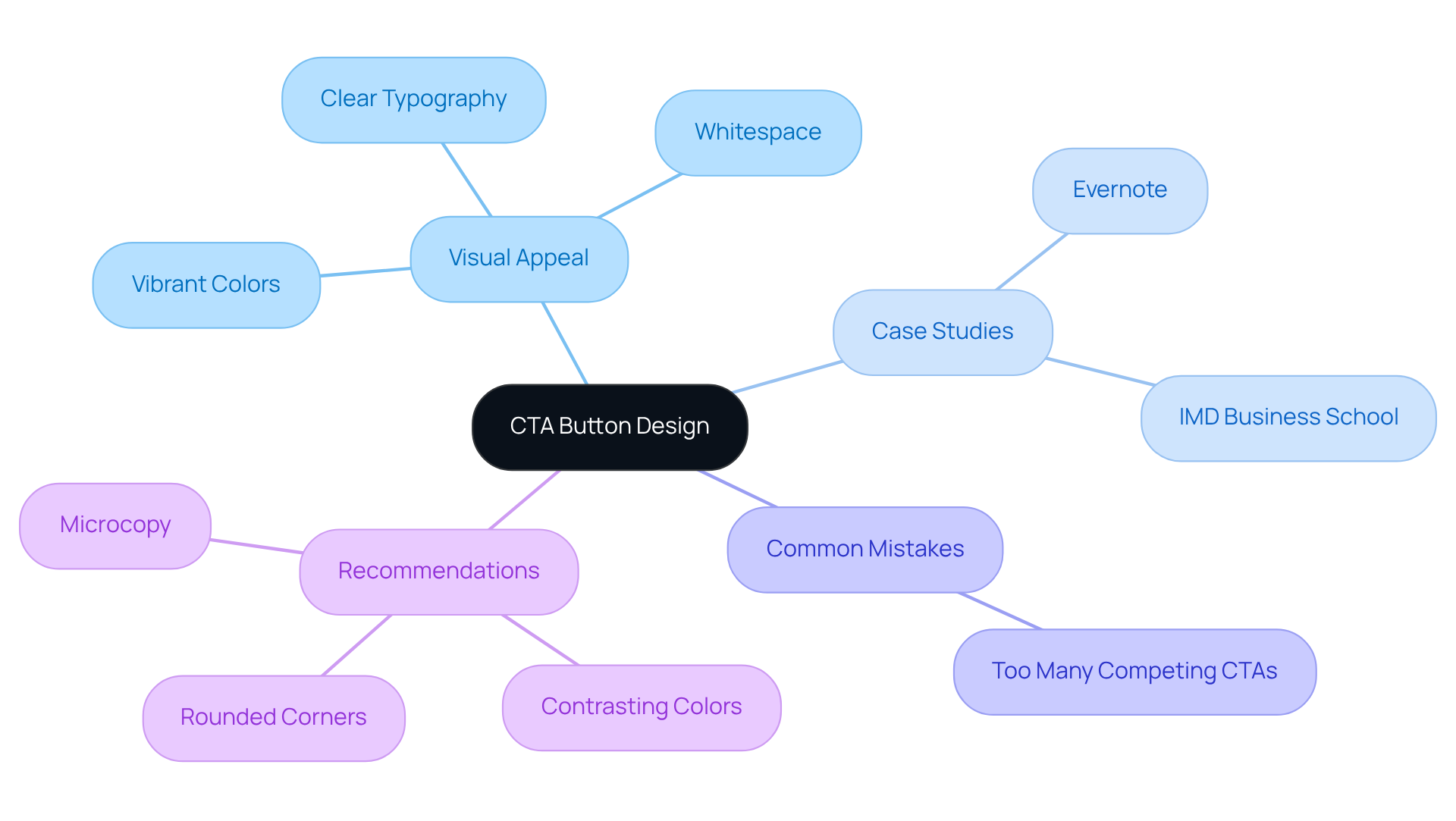
In the competitive landscape of digital marketing, CTA button ideas play a pivotal role in influencing user behavior and driving conversions. Effective CTA button ideas leverage vibrant colors, clear typography, and ample whitespace, ensuring these elements capture user attention effectively. The significance of visual appeal in design is underscored by statistics showing that button-based calls to action can enhance click-through rates by approximately 30% compared to generic text-based prompts.
Case studies illustrate the impact of design on conversion rates. For instance, Evernote’s streamlined approach, which emphasizes a single, clear CTA, effectively funnels users towards signing up, demonstrating how limiting choices can enhance decision-making. This aligns with expert insights, such as Andi Coombs’ assertion that the importance of calls to action cannot be overstated. Notably, 90% of website visitors only read headlines and call-to-action copy. Similarly, the strategic placement of CTA buttons, as seen in the IMD Business School’s landing page redesign, resulted in a remarkable 63% increase in conversion rates by repositioning the CTA above the fold.
However, ecommerce store owners should also be aware of common mistakes that hinder CTA conversions, such as having too many competing CTA button ideas, which can create decision paralysis. Recommendations include:
- Using contrasting colors to ensure visibility
- Employing rounded corners to draw attention
- Adding microcopy-short, persuasive text accompanying the button-to communicate the benefits of clicking, further enticing users to engage.
By concentrating on these design features, ecommerce companies can create engaging CTA button ideas that not only attract clicks but also significantly impact their bottom line.
SitePoint: Best Practices for Effective CTA Buttons
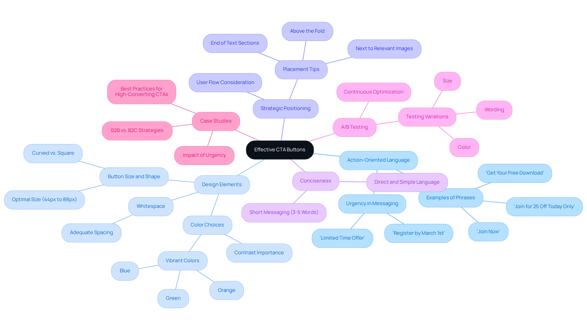
In the competitive landscape of eCommerce, implementing effective cta button ideas is crucial for maximizing conversions. Best practices involve utilizing action-oriented language that encourages individuals to engage, which can include various cta button ideas such as ‘Get Your Free Download’ or ‘Join Now.’ Ensuring high contrast between the button and its background is crucial; vibrant colors like green, blue, and orange typically perform well, enhancing visibility and prompting clicks. Strategic positioning of calls to action is also essential; they should be located at the conclusion of text sections, next to relevant images, or above the fold to capture audience attention promptly.
Being concise is essential in crafting effective CTA messaging. Keeping text between three to five words maximizes readability and encourages quick decision-making. For instance, phrases that create urgency, such as ‘Join for 25% Off Today Only,’ can significantly enhance engagement. A/B testing different variations of cta button ideas, such as size, color, and wording, is vital for maximizing effectiveness and can help identify the most effective designs, leading to improved engagement and conversion rates.
Case studies highlight the importance of these practices. For instance, calls to action that convey urgency, such as ‘Limited Time Offer,’ have been shown to lead to higher conversion rates. Furthermore, well-crafted calls to action that include sufficient whitespace around them improve visibility, facilitating interaction for individuals. Ensuring that CTA elements are easy to read with a clear text size is vital for keeping the audience engaged. By continuously optimizing CTA strategies based on audience behavior and feedback, businesses can ensure their CTAs remain effective and aligned with customer expectations, ultimately driving better results. Ultimately, the effectiveness of CTAs can be the difference between a successful campaign and a missed opportunity.
Wix: Creative CTA Button Ideas for Website Builders
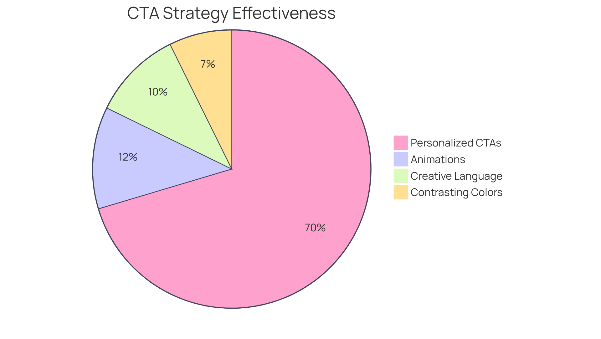
Wix provides a diverse range of creative cta button ideas that can significantly enhance visitor engagement on websites. Using playful language such as ‘Join the Fun’ or ‘Discover Your Next Adventure’ can effectively engage visitors on an emotional level. Wix encourages the use of animations and hover effects to enhance interactivity, increasing user click rates.
Statistics indicate that cta button ideas enhance click-through rates by approximately 30% compared to text-based links, underscoring the importance of visual prominence in CTA design. Furthermore, employing contrasting colors for cta button ideas can enhance visibility, with studies showing that strong color contrast can boost conversions by up to 34%.
Personalized cta button ideas also perform 202% better than generic options, making them a powerful tool for emotional resonance. By strategically positioning CTAs where visitors are likely to engage, website creators can significantly boost conversion rates and drive substantial growth in their ecommerce ventures.
Urgency in CTAs: Boosting Conversions with Time-Sensitive Language
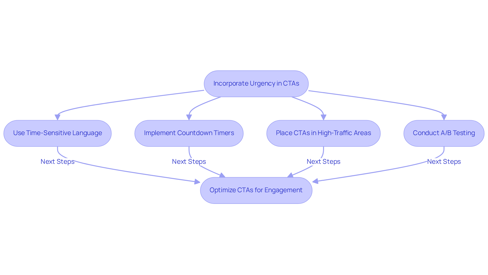
Incorporating urgency in calls to action is crucial for enhancing conversion rates. Phrases such as ‘Limited Time Offer‘ or ‘Sale Ends Soon‘ effectively instill a sense of urgency, prompting users to act swiftly. For example, countdown timers in calls to action have been demonstrated to convert at an average rate of 14.41%, significantly better than the 9.86% conversion rate for those lacking them.
Marketers should place these CTAs in high-traffic areas of their websites or emails to maximize visibility and impact, as hiding them can lead to lower engagement. This way, people are more likely to see prompts that push them to act quickly, leveraging the psychological principle of urgency to minimize hesitation.
Furthermore, case studies, like the ‘Testing Urgency Time Frames‘ study, demonstrate that utilizing urgency can result in substantial enhancements in engagement and conversion rates. It is also essential for businesses to regularly test and optimize their calls to action through A/B testing to identify which strategies resonate best with their audience.
By balancing urgency with clarity, businesses can foster quicker decision-making and drive marketing success.
Psychology of CTAs: Emotional Triggers That Drive Action
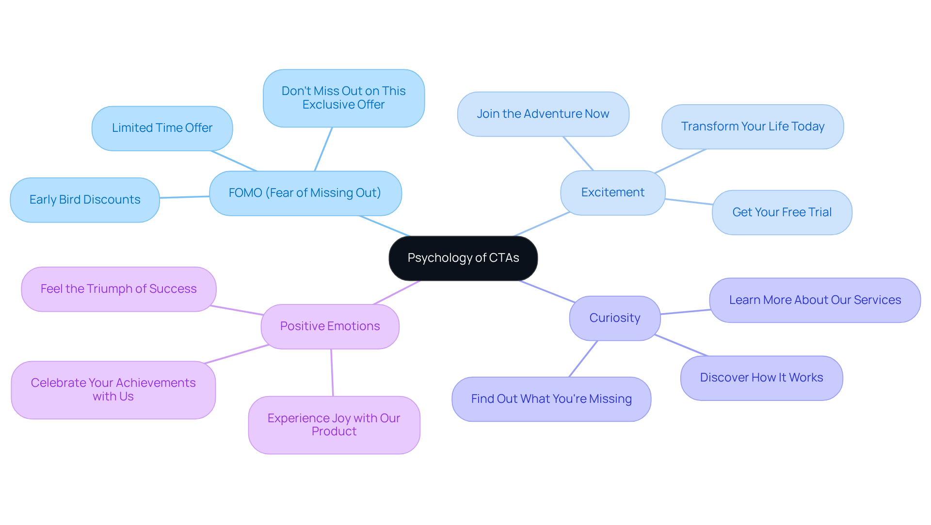
Understanding the psychology behind CTA button ideas is essential for maximizing their effectiveness in driving user engagement. Leveraging emotions like fear of missing out (FOMO), excitement, and curiosity compels users to act. For instance, a CTA like ‘Don’t Miss Out on This Exclusive Offer‘ strategically employs FOMO to drive immediate user engagement.
Studies show that positive emotions like happiness and excitement boost click-through rates by creating a stronger emotional bond with consumers. According to Stephanie Trovato, a marketer and content expert, “Emotion plays a major role in decision making. Users respond when they feel something – curiosity, excitement or urgency.”
Furthermore, CTA button ideas that are tailored to align with personal aspirations can enhance relevance and engagement. Marketers should concentrate on CTA button ideas that not only capture attention but also evoke the desired emotional responses, ensuring clarity and specificity in their messaging.
A/B testing various emotional appeals can assist in pinpointing the most effective triggers; for instance, a SaaS brand realized a 35% rise in click-through rates by adopting a data-driven method for testing and refining their calls to action. By leveraging psychological insights, marketers can craft messages that not only attract attention but also foster lasting connections with their audience.
Diverse CTA Button Examples: Success Across Industries
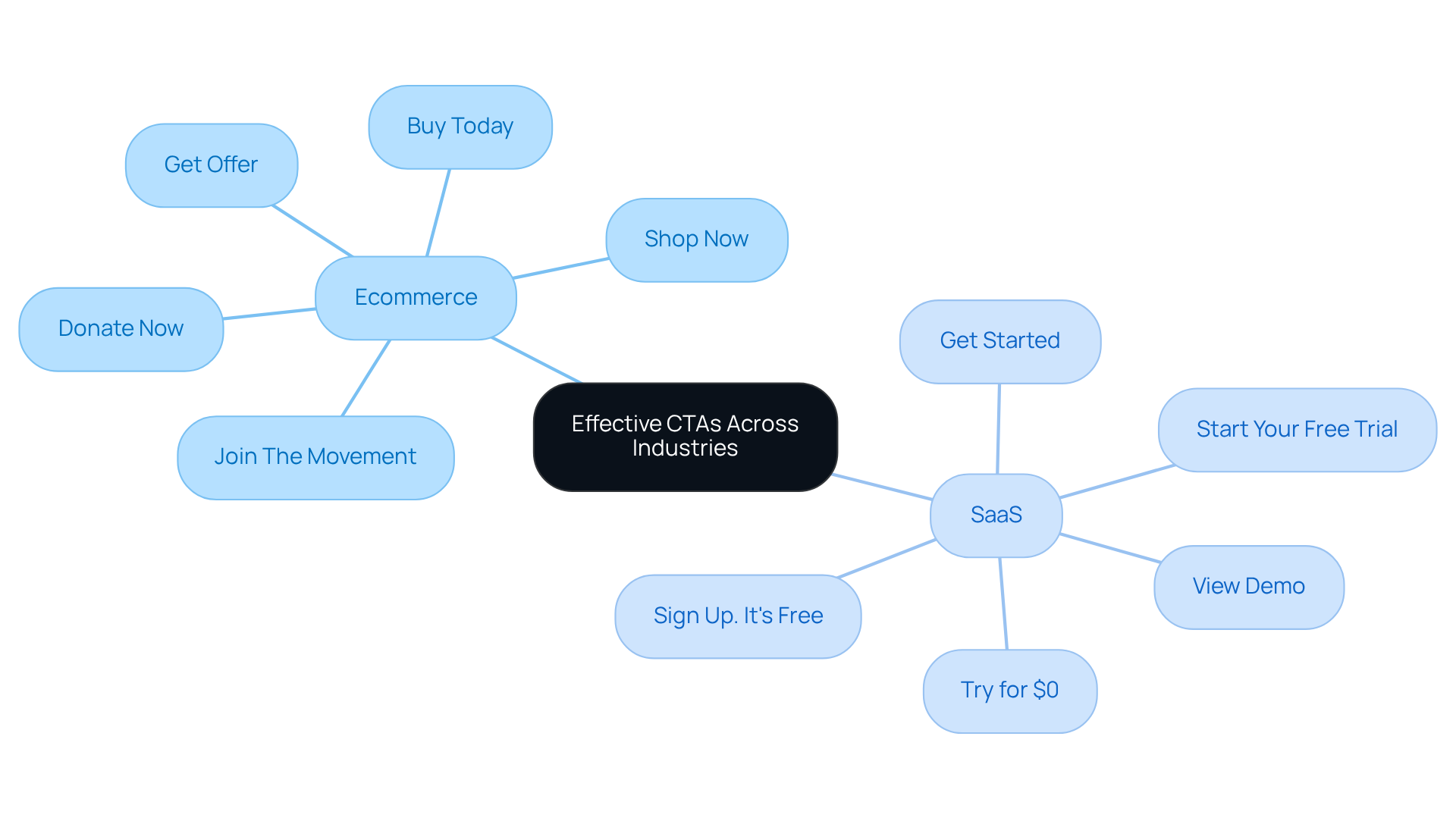
Effective CTAs are crucial for driving engagement and conversions, yet many marketers struggle to create them effectively. Various industries showcase effective CTAs, illustrating how tailored approaches can significantly impact engagement and conversions. For instance:
- An ecommerce site might use ‘Shop Now.’
- A SaaS company could opt for ‘Start Your Free Trial.’
These examples illustrate that customizing CTAs to fit the audience and context enhances engagement and conversion rates. Marketers must analyze successful CTAs within their industry to avoid missing out on effective strategies that drive results.
A/B Testing: Optimizing Your CTA Buttons for Maximum Impact
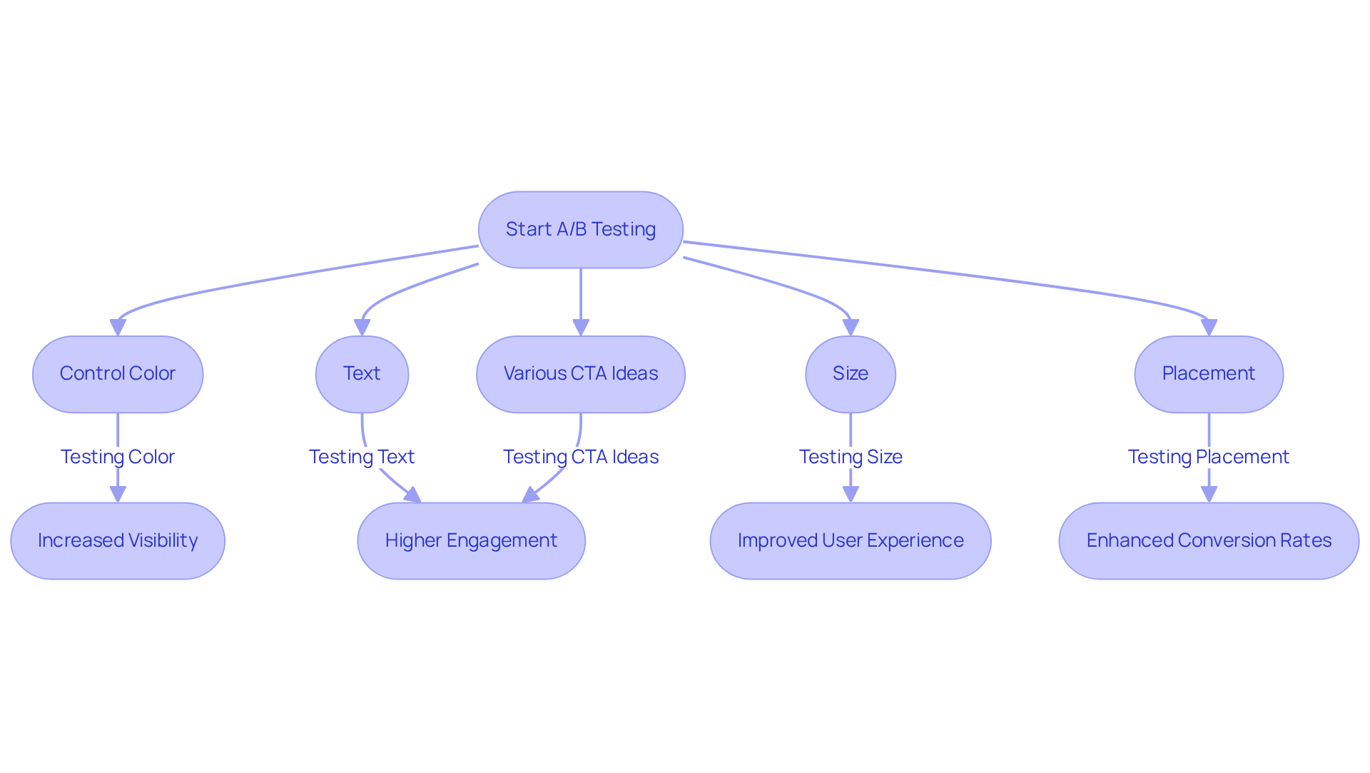
In the competitive landscape of digital marketing, utilizing CTA button ideas and optimizing call-to-action (CTA) elements through A/B testing is crucial for success. Creating two distinct versions of CTA button ideas and testing them across different audience segments enables businesses to determine which variant performs better. Key elements to consider during testing include:
- Control color
- Text
- Size
- Placement
- Various CTA button ideas
For example, implementing CTA button ideas with contrasting colors against the background can greatly improve visibility and user engagement. Studies show that using first-person language in calls to action, like ‘Get My Offer,’ can enhance performance by 10-25% compared to generic phrases, making CTA button ideas critical in the wording choice.
Statistical insights reveal that effective A/B testing combined with CTA button ideas can lead to substantial improvements in conversion rates. For instance, a well-executed test can result in a conversion rate increase of up to 63%, as demonstrated in a case study where repositioning a CTA above the fold led to a significant lift in demo bookings. Additionally, the use of various CTA button ideas, including a secondary CTA alongside a primary one, has shown to boost total conversions by 40%, highlighting the importance of catering to different stages of the buyer journey.
To maximize the impact of A/B testing, it is essential to establish clear, quantifiable goals before initiating tests. This structured approach allows for informed decision-making and continuous optimization. Consistently evaluating different components, such as size – ideally a minimum of 48px for mobile devices – ensures that CTAs remain user-friendly and effective. Ultimately, the strategic application of A/B testing not only enhances the effectiveness of CTA but also generates valuable CTA button ideas that position businesses for sustained growth in a dynamic market.
Mobile Optimization: Designing CTA Buttons for Mobile Users
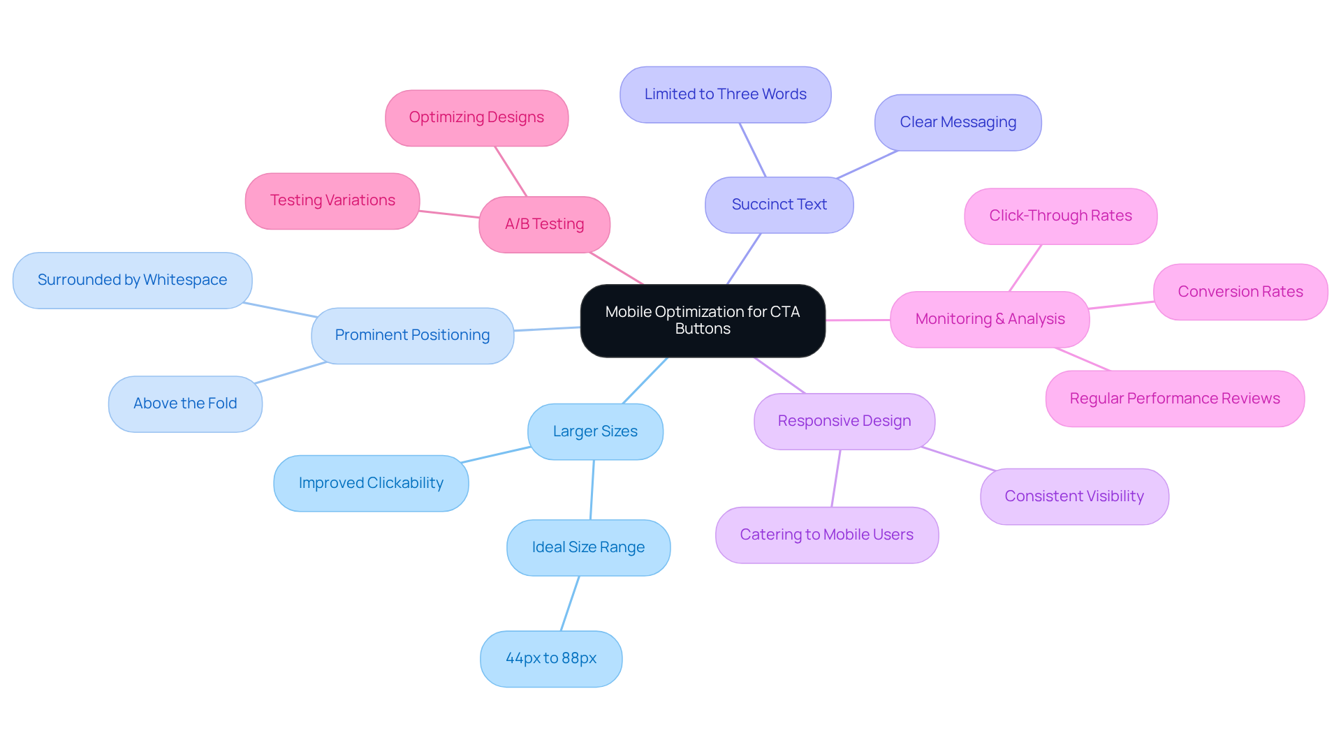
Mobile optimization is often neglected, yet it plays a pivotal role in the effectiveness of CTA button ideas on smaller screens. Effective strategies include CTA button ideas that involve:
- Using larger sizes, ideally between 44px and 88px, to improve clickability on touchscreen devices.
- Positioning CTA button ideas prominently above the fold to ensure visibility.
- Using succinct text limited to three words to enhance readability and clarity.
- Integrating responsive design principles, as most mobile websites often overlook specific mobile user requirements.
- Regularly monitoring and analyzing click-through and conversion rates to ensure continuous optimization.
- Conducting A/B testing on different CTA button ideas to determine which designs yield better results.
Research shows that well-optimized mobile CTAs, including the use of hover states that can increase clicks by up to 50%, can significantly enhance engagement and conversion rates. Neglecting mobile optimization can lead to missed opportunities that directly affect your bottom line.
Color Contrast: Enhancing CTA Buttons for Better Visibility
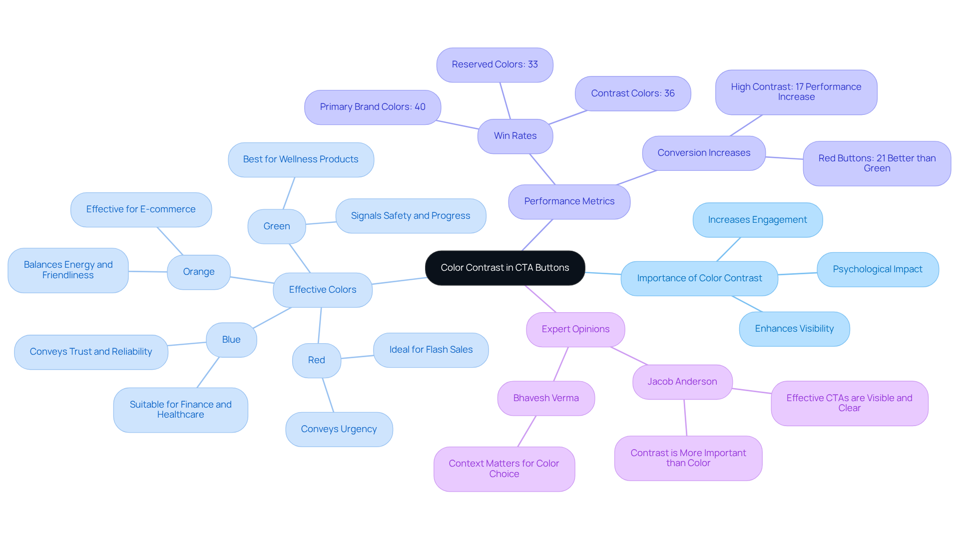
Color contrast plays a pivotal role in the effectiveness of cta button ideas, directly impacting user engagement and visibility. High-contrast colors allow controls to stand out against their backgrounds, making them more noticeable. For instance, a bright orange icon on a dark background effectively captures attention and encourages clicks. Research shows that red controls can achieve a contrast ratio of 6:1 to 8:1, leading to a 17% increase in performance compared to a baseline of 4.5:1 (source: key_points). This underscores the necessity of selecting colors that align with brand identity while simultaneously enhancing visibility.
In 2026, the most effective colors for social ads include red, orange, green, and blue, each serving distinct purposes (source: key_points). Red, for example, conveys urgency and is ideal for time-sensitive promotions, while green signals safety and progress, making it suitable for wellness and eco-friendly products. A study analyzing 2,106 A/B tests revealed that cta button ideas using primary brand colors had a win rate of 40%, compared to 36% for contrast colors and only 33% for reserved colors (source: case_studies). This finding calls into question the assumption that contrast colors are universally more effective.
Case studies further illustrate the impact of color contrast. For instance, brands employing eco-friendly indicators have experienced notable conversion increases in certain areas, including a 9.2% rise in the Middle East (source: case_studies). Furthermore, the Von Restorff effect emphasizes that elements with strong contrast are more likely to stand out, reinforcing the need for careful color selection in design.
Expert opinions highlight that the optimal hue for a control is one that contrasts with its background, rather than following a universal best color guideline. This approach ensures that the cta button ideas are not only visually appealing but also effective in driving user actions. By understanding the nuances of color contrast, marketers can refine their strategies to maximize user interaction and conversion rates.
Clarity and Brevity: Crafting Effective CTA Button Text
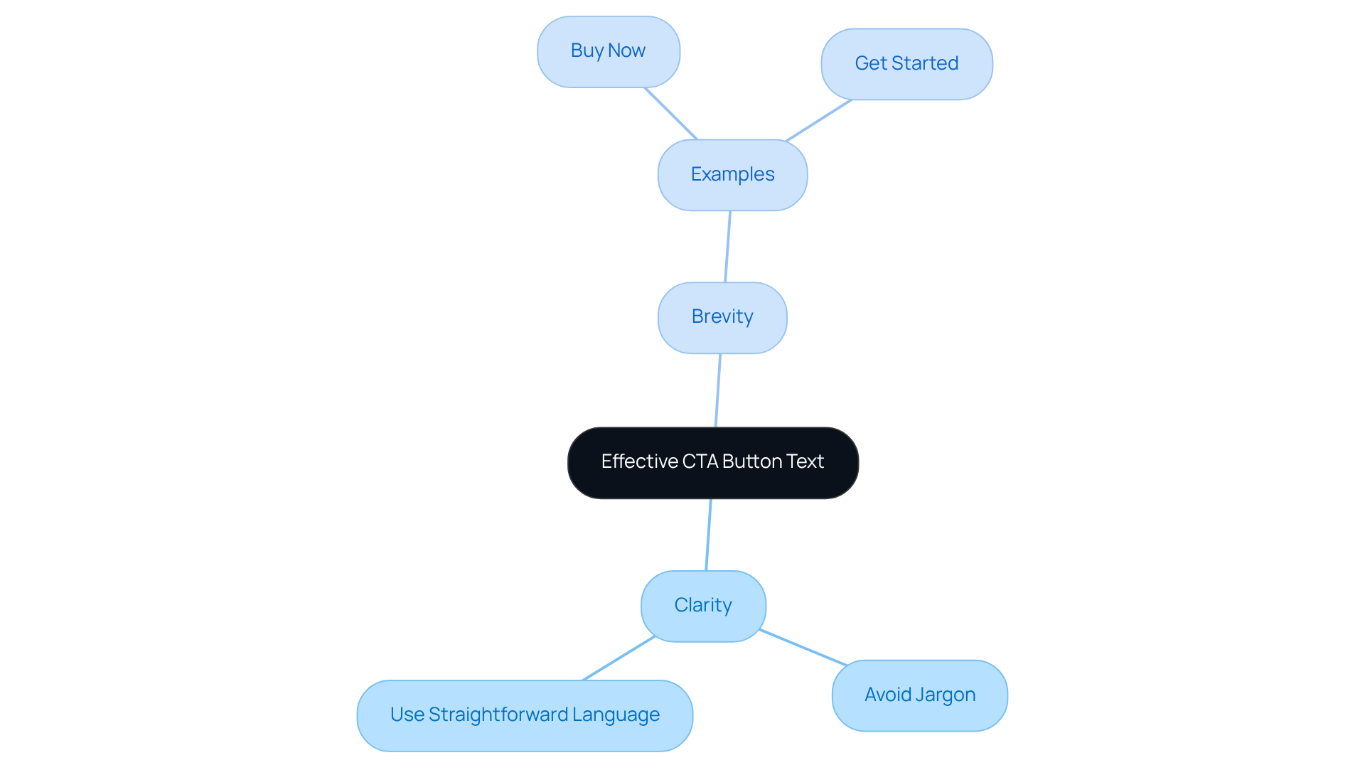
Crafting effective cta button ideas requires a focus on clarity and brevity to drive immediate action. Effective cta button ideas, like ‘Buy Now’ or ‘Get Started,’ are straightforward and encourage immediate action. Avoiding jargon and using straightforward language ensures that individuals quickly grasp the desired action.
Strategic Placement: Positioning Your CTA Buttons for Success
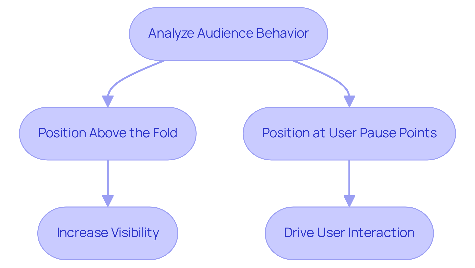
To maximize the effectiveness of cta button ideas, it is essential to focus on their strategic placement. Enhancing visibility can be achieved by strategically placing cta button ideas in areas where users typically pause, like at the end of product descriptions or in the hero section.
Using effective cta button ideas by positioning them above the fold ensures they catch the eye without scrolling, increasing the likelihood of user interaction.
Marketers should analyze audience behavior to determine the optimal placement for their specific group. Understanding audience behavior is key to ensuring that CTAs resonate and drive action.
Personalization: Crafting Tailored CTA Buttons for Your Audience
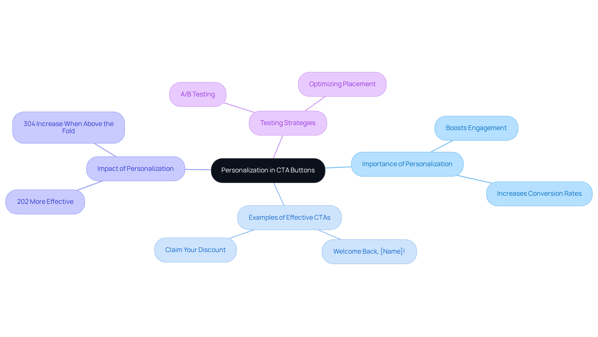
While generic calls to action often yield minimal results, personalized approaches can significantly boost user engagement. Using cta button ideas that reflect user-specific messages, such as Welcome Back, [Name]!, can enhance engagement. Claim Your Discount is an example of effective cta button ideas that creates value and drives action. Data analytics are essential for this process, enabling marketers to gain insights into their audience and develop effective cta button ideas that resonate. For example, personalized calls to action have been demonstrated to convert 202% more effectively than generic options, highlighting the significance of customization. Furthermore, case studies, like the one on the Impact of Personalized Calls to Action, demonstrate that incorporating personalized elements into cta button ideas can lead to significant boosts in engagement and conversion rates. Additionally, the positioning of calls to action is vital; those located above the fold can enhance conversions by up to 304%. To maximize effectiveness, consider A/B testing various personalized cta button ideas to discover the most effective messaging for your audience.
Action-Oriented Language: Driving Engagement with Strong Verbs
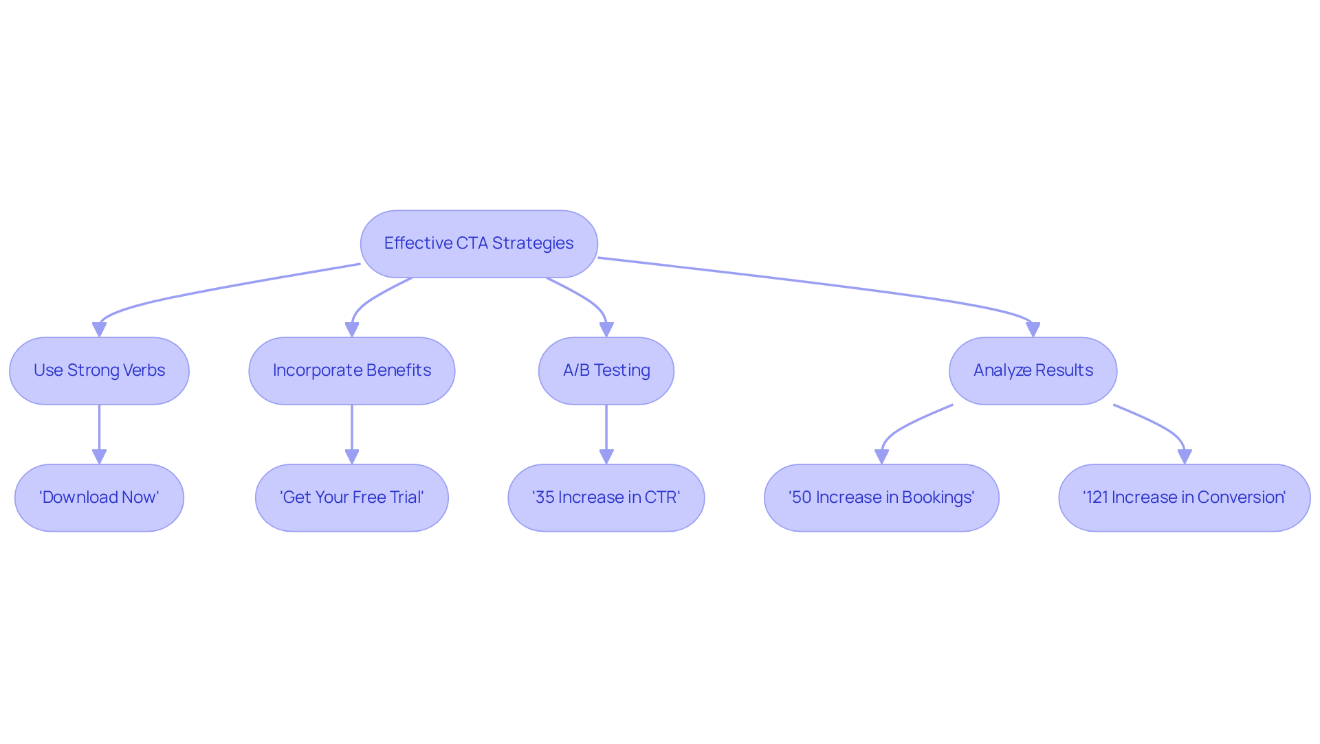
Effective cta button ideas are essential for driving audience engagement and conversions. Phrases like ‘Download Now’ and ‘Get Started’ prompt immediate action by creating urgency. Marketers must use strong verbs that clearly convey desired actions, guiding individuals on the next steps. Incorporating benefits in cta button ideas, like ‘Get Your Free Trial,’ clarifies actions and encourages clicks.
Case studies indicate that effective CTAs significantly boost engagement. For example, ABC Financial Advisors saw a 50% increase in bookings for free financial reviews after updating their CTAs. Brands that prioritize accessibility report up to 15% higher engagement, underscoring the importance of action-oriented language in conversions.
A/B testing cta button ideas is essential for continuous improvement, enabling marketers to refine strategies based on data and audience preferences. Clear, compelling CTAs guide users toward meaningful interactions and strengthen audience connections.
Experimentation: Testing Different CTA Designs for Optimal Results
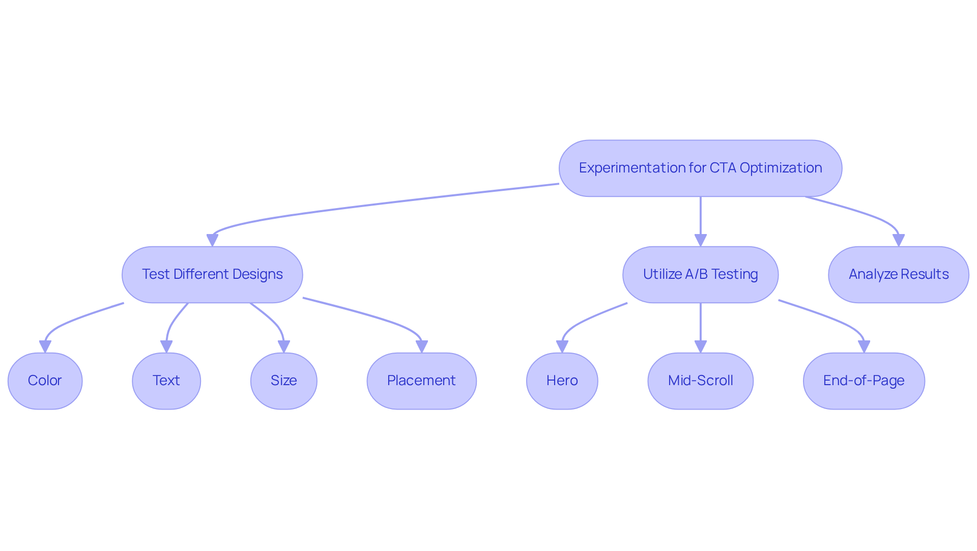
In a competitive landscape, the optimization of cta button ideas through experimentation is not just beneficial; it is essential. Marketers should consistently test various cta button ideas, including color, text, size, and placement, in their calls to action. Research shows that strategically designed cta button ideas can significantly increase click-through rates, with boosts of up to 371%. This highlights the critical role of thoughtful experimentation in marketing strategies.
For effective results, it is essential to utilize A/B testing to determine the best positions for cta button ideas, such as:
- hero
- mid-scroll
- end-of-page placements
as highlighted by VictorFlow. By analyzing client interactions and conversion rates, businesses can pinpoint which designs resonate most effectively with their audience. This iterative approach fosters continuous improvement and ensures that calls to action align with evolving audience preferences.
Furthermore, audience segmentation and personalization are essential, as they assist in customizing calls to action to particular demographics and behaviors. Case studies reveal that brands employing A/B testing for their cta button ideas and designs have seen significant increases in engagement and conversion rates, demonstrating the value of a data-driven strategy in refining marketing efforts. Ultimately, brands that prioritize experimentation will not only enhance their conversion rates but also secure their position in an ever-evolving market.
User Feedback: Refining Your CTA Buttons Through Input
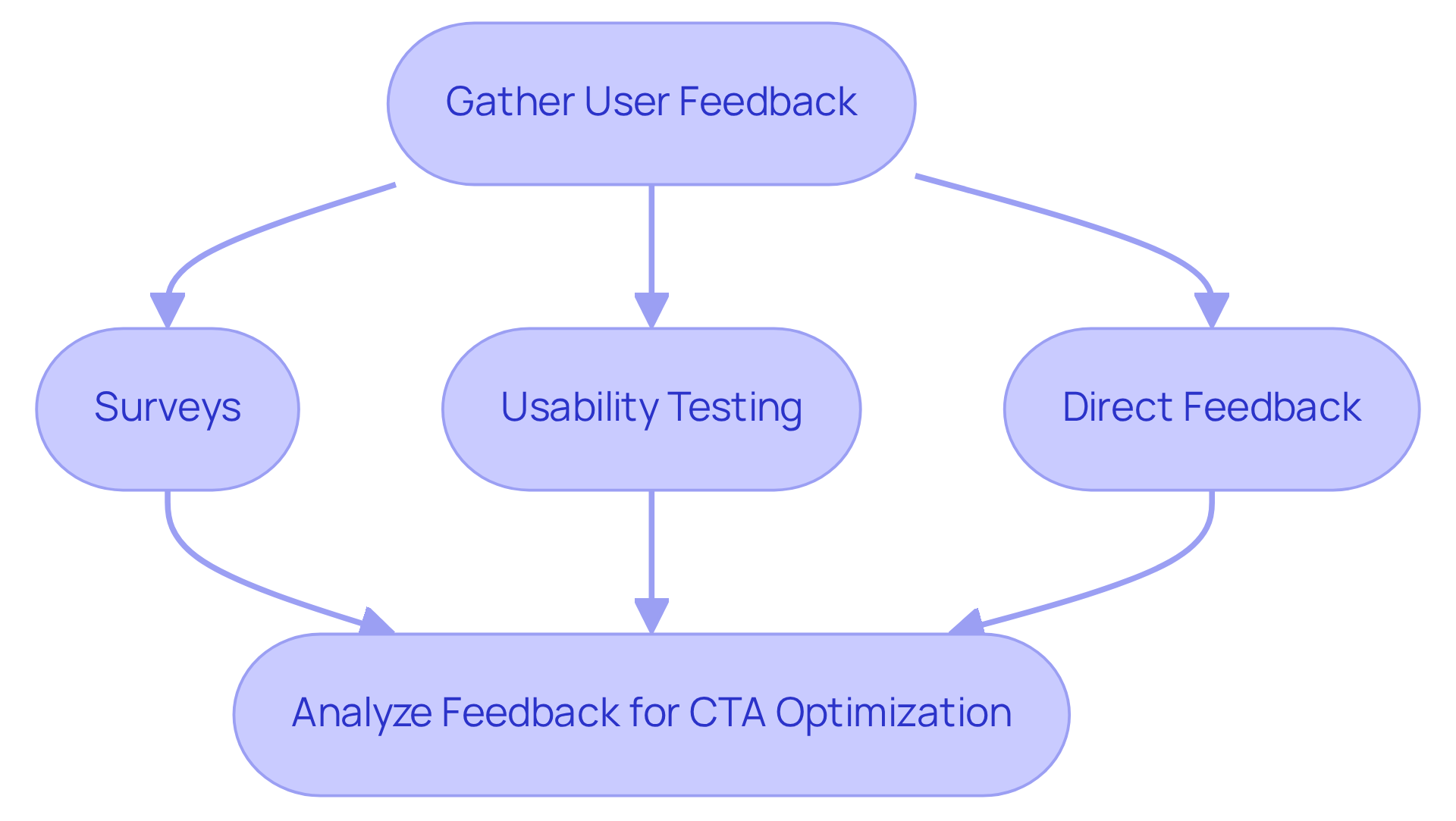
Feedback is a critical component in the optimization of CTA button ideas, yet many marketers overlook its significance. Marketers must gather insights from users about their experiences with CTAs through methods such as:
- Surveys
- Usability testing
- Direct feedback
This information reveals which elements of CTAs perform well and which do not, allowing companies to make data-driven adjustments. Prioritizing user feedback empowers companies to create effective CTA button ideas that significantly enhance engagement and conversion rates.
Conclusion
In eCommerce, the effectiveness of call-to-action (CTA) buttons can make or break a sale. Creative CTA button ideas can greatly influence consumer behavior, encouraging immediate actions that boost conversions. The insights shared throughout this article underscore the importance of clarity, urgency, and personalization in crafting CTAs that resonate with target audiences.
One key strategy is A/B testing, which helps refine CTA designs based on how users interact. Additionally, the impact of color contrast and strategic placement on visibility is crucial, as is the effectiveness of action-oriented language in driving engagement. The role of emotional triggers and urgency in CTAs cannot be overstated; they create compelling reasons for users to act swiftly. By integrating these elements, brands can create visually appealing and functionally effective CTAs that not only attract clicks but also foster lasting customer relationships.
Ultimately, optimizing CTA buttons requires ongoing experimentation, user feedback, and a deep understanding of audience preferences. By prioritizing these strategies, eCommerce businesses can enhance their marketing efforts, ensuring that their CTAs not only capture attention but also convert interest into action. By mastering these strategies, brands can not only enhance their CTAs but also secure a competitive edge in the digital marketplace.
Frequently Asked Questions
What are effective CTA button ideas for maximizing engagement?
Effective CTA button ideas should be clear, concise, and prompt immediate action. Phrases like “Get Your Discount” or “Join Now” can significantly boost engagement, leading to a 40% rise in sales and a 46% reduction in costs.
How does A/B testing contribute to CTA effectiveness?
Regular A/B testing helps refine CTA button ideas by allowing businesses to adapt based on real user interactions and preferences, enhancing conversion rates and ensuring CTAs resonate with the target audience.
What services does Surge Affiliate Marketing offer to ecommerce store owners?
Surge Affiliate Marketing offers a complimentary program audit to help ecommerce store owners identify untapped potential in their affiliate programs, enhancing revenue streams.
What design strategies does KlientBoost use for CTA buttons?
KlientBoost utilizes contrasting colors and unique shapes to enhance visibility, emphasizing visual hierarchy to ensure CTA buttons are attention-grabbing and intuitively positioned.
What are the key elements of effective CTA buttons in email marketing?
Effective email marketing CTA buttons use action-oriented language, are positioned above the fold for visibility, and should be mobile-friendly. A single, clear CTA can increase click-through rates by up to 42%.
How does mobile optimization affect email CTA buttons?
With over 70% of email opens occurring on mobile devices, it is essential to implement mobile-friendly and visually distinct CTA button ideas to maximize engagement.
What impact do personalized CTAs have on engagement?
Personalized CTAs tailored to specific audience segments can lead to substantial increases in engagement, with one campaign achieving a 39% click-through rate by aligning offers with audience interests.
What role do social sharing icons play in email campaigns?
Emails that include social sharing icons have a click-through rate of 6.2%, compared to 2.4% for those without, highlighting the value of integrating these elements into email designs.
What design principles does Figma emphasize for creating effective CTA buttons?
Figma emphasizes large, easily clickable controls, clear and concise text, and maintaining a consistent style that aligns with the overall brand to enhance user experience.
How can visual appeal influence CTA button effectiveness?
Effective CTA button designs leverage vibrant colors, clear typography, and ample whitespace, which can enhance click-through rates by approximately 30% compared to generic text-based prompts.
What common mistakes should ecommerce store owners avoid with CTA buttons?
Common mistakes include having too many competing CTA button ideas, which can create decision paralysis. Recommendations include using contrasting colors, rounded corners, and adding microcopy to communicate benefits.
Need help applying this?
Let's pressure-test your affiliate program.
Surge runs affiliate programs for ecommerce brands across the U.S. The audit is complementary — book a call to see what a healthier publisher mix and tighter commission design could do for your numbers.
LET'S SURGE!